CampaignHQ · Design system
One design system for CampaignHQ and Kumo, the company behind it: two brands and two themes from one library
CampaignHQ is a WhatsApp, email and SMS marketing platform. Kumo is the company that builds it (the KumoHQ of my Kumo Board case study). Neither had a design system, so over four months I built one from scratch.
- What
- A design system for CampaignHQ and for Kumo: colours, type, sizes and 20 components, in Light and Dark.
- Why
- Design, development, sales, marketing and growth each drew their own CampaignHQ, and nothing tied them together.
- The idea
- Screens ask for a role, like "main text", never a colour. One switch picks the theme, another picks the brand.
- The hard call
- 20 components, not 60. Only what a real screen needed, so one designer could keep it right.
The problem
Every team was drawing its own CampaignHQ
There were no shared colours, type or components. Just the website and two brands' colours, copied by each team its own way.
Every screen started from nothing
Buttons, tags and text were drawn by hand each time, so two screens rarely matched.
Each team had its own shades
Product, sales, marketing and growth picked colours by eye, so the same brand looked different on a screen, a deck and a post.
Dark mode meant redrawing everything
With colours typed into every screen, a dark version was a second copy of the product.
A second brand meant a second product
Kumo needed the same screens in its own colours and type, which would double every change.
Screens and slides that didn't quite match.
Nothing was decided once. Every colour, size and typeface was decided again on every screen, by every team.
- Uber
- Keep raw colours apart from what they mean, so a theme can change one without touching the other.
- IBM
- Name tokens by their job, like "text primary", so the name says where it goes.
- Atlassian
- Put the usage note right on the component, where people already look.
The systems I studied first, and the one idea I took from each.
A screen asks for a role, never a colour
A token (in Figma, a variable) is a named value, like Text/Primary, that holds a colour or a size. I split them into three levels, each pointing to the one below.
Define every colour once
Brand holds every raw colour. Alias gives each one a role, like Primary or Error. Mapped says where a role is used, like Text or Surface. Screens and components only ever use Mapped.

Put each switch on one level
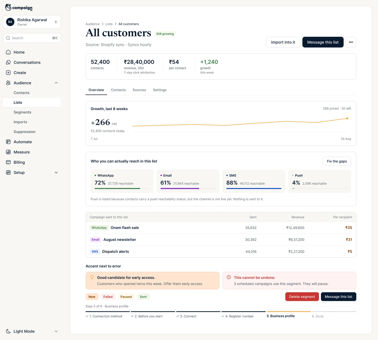
A mode is a set of values a token can switch between. Themes (Light, Dark) are modes of Mapped; brands (CampaignHQ, Kumo) are modes of Alias. A theme changes where a role is used, a brand changes what it means, so the two switches never collide.

Dark mode is designed, not inverted

Switch the whole screen from one place
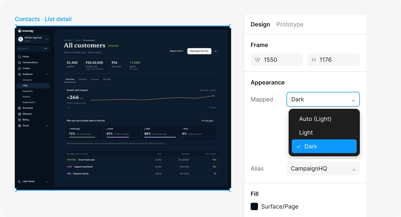
Select a frame, open the theme in Figma's Appearance panel, pick Dark. Every component inside follows, because none of them holds a colour of its own.
Kumo is one more mode, not a second library
Both brands already had their colours; each team just used its own version. I didn't pick new ones. I tied the existing ones into one system.
Prove it on a real Kumo screen
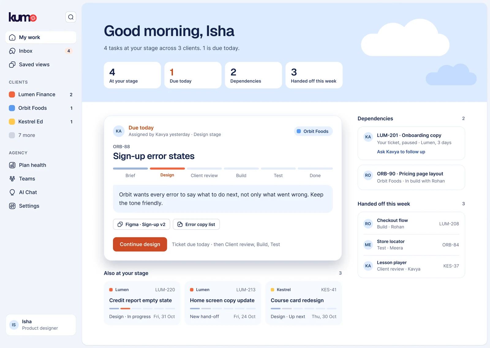
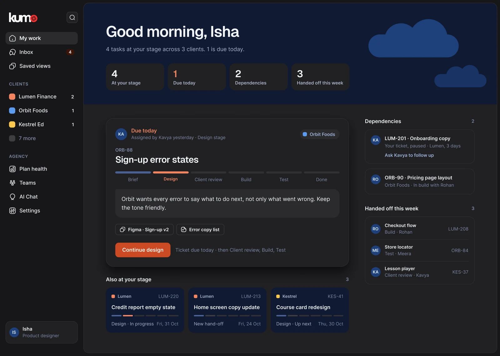
Recolouring a CampaignHQ screen only proves colours swap. So I rebuilt My work, the home screen of Kumo's own project tool, from the same components.
Let a brand carry type and sizes too
Kumo isn't CampaignHQ in new colours. Its headings use Geist, its buttons are 42px and its sidebar rows 36px. So Alias holds a type scale and control sizes per brand, not just colours.

Give the main action its own role
CampaignHQ's buttons and text share one navy. Kumo's text is navy but its buttons are coral. So buttons got their own role, Action, and each brand fills it in.
Keep what status means, let the shade vary
Red is an error and green is done in both brands, but each brand uses its own shade.
Ruled out
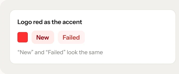
Kumo's logo red as the product accentIt sat 0.4° of hue from the error red, so a "New" badge read as a failure. The red stays in the logo; inside the product, Kumo's accent is coral.
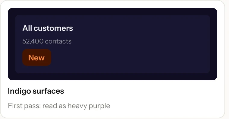
Kumo's indigo for dark surfacesIt read as heavy purple. Neutral graphite lets Kumo's coral lead instead.
Moving warning to goldCampaignHQ's orange sat a few degrees from the warning amber. Gold gave olive text, so I tuned the orange's tints instead.
Only what a real screen needed
Set type in the brand, not the style
Newsreader for titles, Inter for everything else. Each style's typeface and size come from Alias, so Kumo's headings switch to Geist without a second set of styles.

One component instead of every drawing
A component is a reusable piece, like a button; its variants are its versions, like Primary or Disabled. Tags drawn three different ways became one Badge: the tone carries the channel or status, the size carries the density.

Never let colour carry meaning alone
Each callout tone has its own icon, so a warning still reads as a warning in either brand and either theme, and for anyone who can't tell amber from coral.


The hard call
20 components, not 60
- Decision
- Ship 20 components, each one proven by a real screen, and leave the rest out.
- Why
- Every component has to stay right in two themes and two brands. A smaller library that's always right beats a bigger one nobody trusts.
- What it changed
- New components arrive with the screen that needs them, so the library grows with the product.
A component joins with its screen
No speculative parts. Each one comes with the screen that proves it.
Every component explains itself
Usage notes sit in each component's description, so hovering it in Figma says when to use it.
Tokens speak code
Every token carries its CSS name, so a developer reads var(--surface-action), not a hex code.
No loose colours
An audit finds any colour not tied to a token. In the components today, it finds none.
In use
Four teams build from one library
- A second brand
- Kumo runs from one Alias mode. The components were set up once to read each brand's sizes, and no screen was redrawn.
- Development
- In Dev Mode, Figma's handoff view, a primary button reads
var(--surface-action), the same name the code uses. - Sales and marketing
- Decks and posts use the same logo, type and colours as the product.

What I learned
Three things I'll carry into the next system
Measure before you argue
A 0.4° hue gap settled Kumo's accent faster than any opinion about colour.
A brand is more than its colours
Kumo needed its own typeface and sizes. Next time the brand level holds numbers from day one.
Colour always needs a backup
Every clash I fixed with colour, I also fixed with shape or words: icons on callouts, labels on badges.
Next for the system: the Stepper's final direction, chosen with the founders, and templates for sales and marketing.
Redesigning KumoHQ's project tool so the whole team uses it
You made it to the end. Thanks for reading :)