Dish N Dash · 0→1 product
It had to book in ninety seconds, and never feel like a booking app
Dish N Dash is a dine-in operating system for Riyadh, not just a booking app. Three parts: an app for diners, a dashboard restaurants use during service, and an admin panel for the internal team. The client gave us a brand and a written direction for how it should feel, but not what it should do.
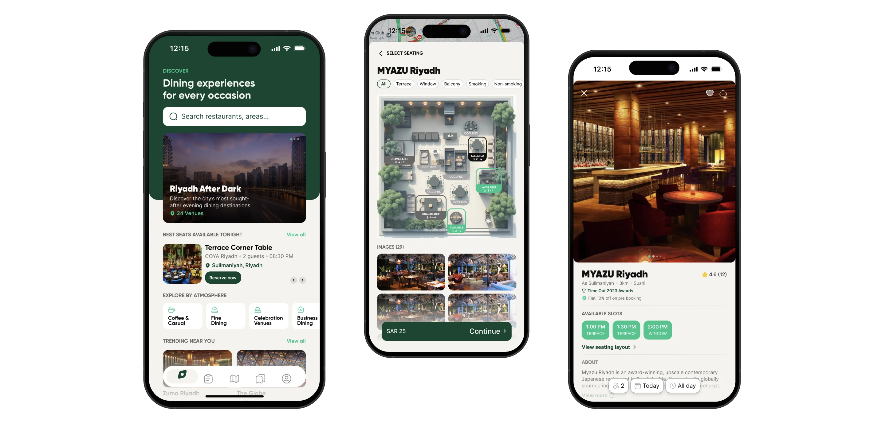
- The problem
- The brief asked for a booking in under ninety seconds, and warned that the app must not feel like just another reservation app. Those two pull in opposite directions.
- The idea
- Keep every feature that makes it special, and make each one skippable. Same flow, two speeds.
- What I delivered
- 3 surfaces (diner app, restaurant console, platform admin), 100+ screens and states including every error and empty case, and two design systems.
- My proposals
- Two ideas weren't in the brief: seat selection on a real floor plan with a 360° preview, and a two-stage restaurant approval.
The problem
The app had to do two things that fought each other
The client supplied three documents: brand guidelines, a UI direction, and a set of access rules. The UI direction opens by saying what it isn't: a vision, not a specification. It does not define screens, components, layouts or flows.
What it does define is unusually detailed. Ten rules for how a screen must feel. An eight-point quality checklist. Twenty-one things never to do. And it names what failure would look like for each surface: for the diner app, feeling like just another reservation app. On the same page was a hard number: a returning diner should get from opening the app to a confirmed booking in under ninety seconds.
The app must be unhurried
- Editorial pacing, not catalogue browsing. The photography does the emotional work.
- One decision per screen during booking.
- The diner should never have to think about how the app works.
The app must be fast
- A returning diner reaches a confirmed reservation in under ninety seconds.
- Every step earns its existence. If a step can be removed, remove it.
- They want confidence, not options.
How I decided
Four rules I could be held to
The special features are the optional ones
The features that make the app special must never slow the booking down.
Density is earned
The diner app is generous with space. The console is dense because it has to be. The admin gets out of the way.
Colour is hierarchy, not decoration
One green. Emerald means live, and nothing else.
Self-evident over explained
No coach marks allowed, so structure and copy carry orientation.
- Primary metric
- Under ninety seconds from app open to confirmed reservation, for a returning diner. Agreed before any pixels.
- Guardrail
- Pre-order and seat-selection rates must not collapse because those steps became skippable. The whole bet is that you can protect speed without losing the revenue that speed threatens.
What I built
Why I made the best features optional
All five decisions come from the same idea: if a feature makes the app better but slows the booking down, make it optional instead of cutting it. Two of them started as proposals I put to the client rather than requirements I was given.
The features that make it special are the ones you can skip
Seating and pre-order each offer Continue without selection, and serve-time defaults to On arrival. Same flow, two speeds.
- Profile
- Details
- Seating
- Pre-order
- Review
- Pay
- Confirmed
- Profile
- Details
- Seating
- Pre-order
- Review
- Pay
- Confirmed
To addScreens of the full path and the fast path side by side, to sit under this diagram.
The full path is the first-time experience; the skip is the accelerator, and neither one is a separate mode to learn.
What it cost: pre-ordering and paid seat selection are two of the platform's three revenue lines. Making them skippable protects the ninety seconds and means fewer people use them. I chose the speed, then built the admin dashboard that tracks pre-order commission, seat-selection fees and deposits, so we'll know whether it was the right call.
The diner and the restaurant see the same booking, live
The diner sets when food should arrive: on arrival, or ten, twenty or thirty minutes after they're seated, and the restaurant sees it on the reservation. Running the other way, "I'm running late" is the primary action on an upcoming booking. The host's screen flips that reservation to Running late, and the notification reads "~10 min, from diner app".
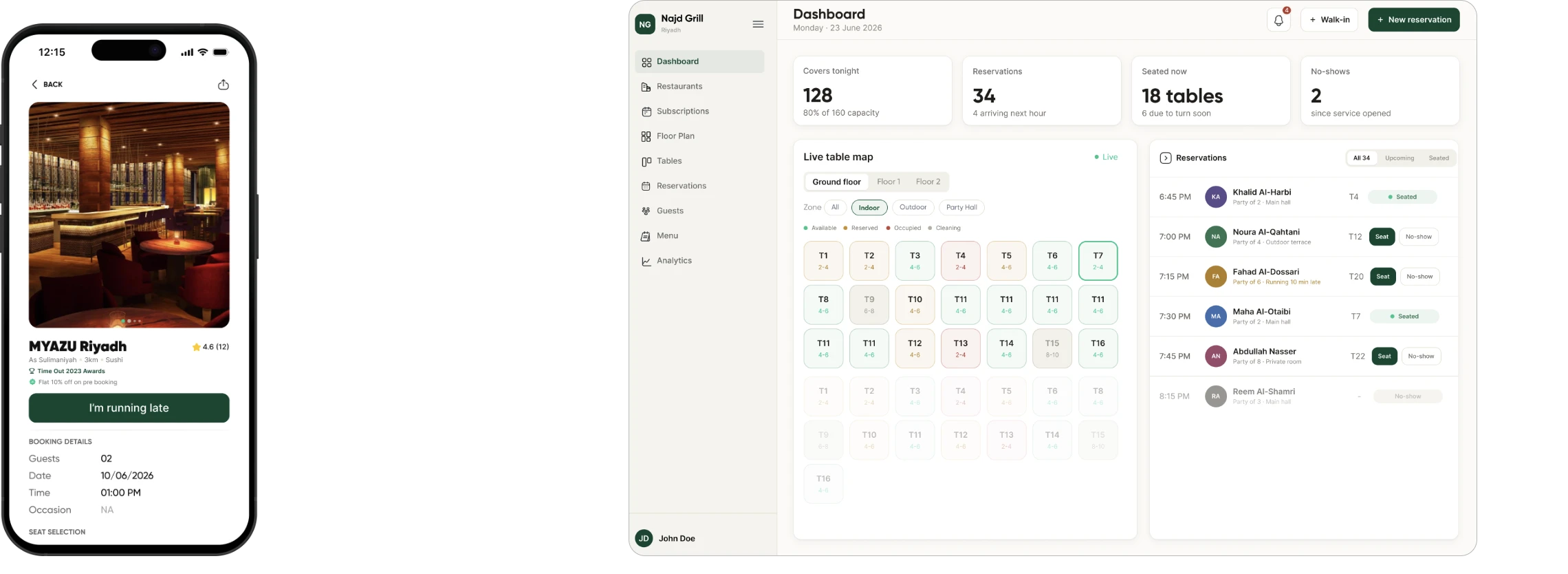
Here the feedback crosses between two products: the diner's tap changes what the host sees, and the host's screen says where the information came from.
Seat selection as a floor plan
The brief wanted seat choice to feel considered, but a list of table numbers can't carry that. I proposed letting restaurants upload a real floor plan during onboarding, plus a 360° preview of the room, so a diner sees where they'll actually sit. Zone filters, a live plan of free, taken and selected tables, priced seats, and a specific error: "Please select seating for 2 guests to continue."
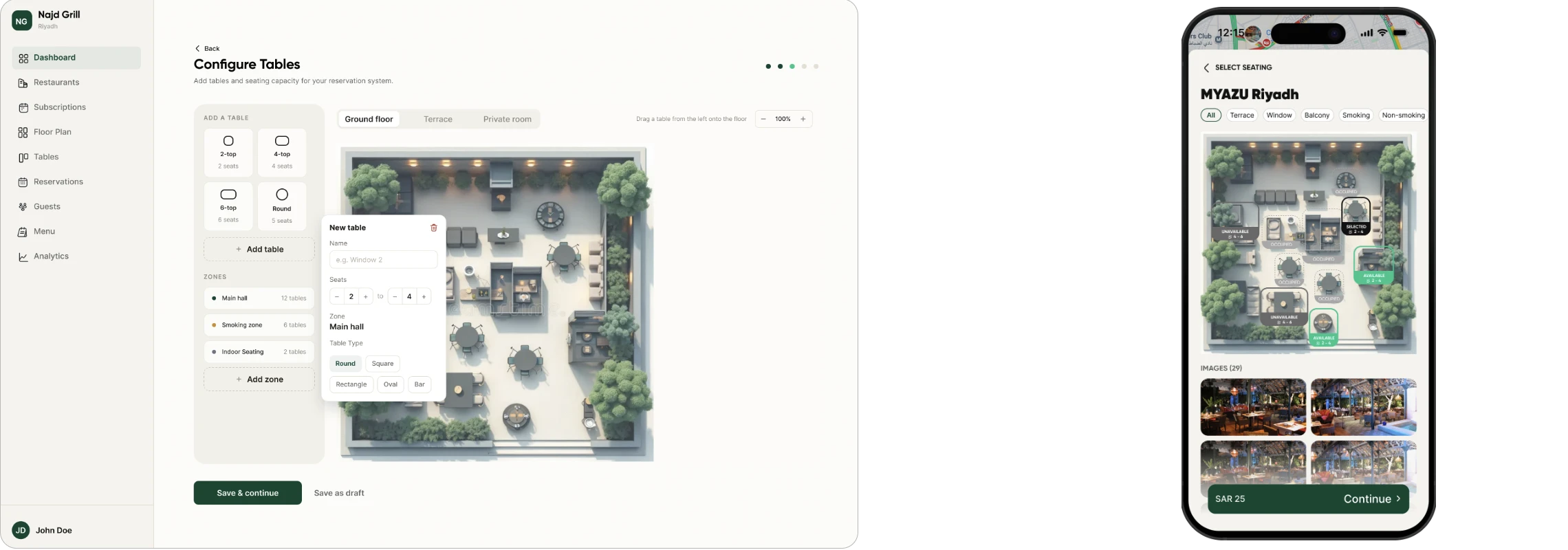
"T12" is recall. A table by the window, on a plan of the room you're about to sit in, is recognition.
Turning the access rules into something a person can use
The client's access rules had three parts: your role decides which sections you see, your scope decides which restaurants, and a sensitivity level decides which details stay hidden. Turning that into screens was the design work.
- Role
- Operations, Finance and Infrastructure each get their own dashboard, rather than one dashboard with three permission levels.
- Scope
- A regional lead sees their region's restaurants, not the whole Kingdom. Wider access is a request with a written reason, reviewed and logged, not a settings toggle.
- Sensitivity
- Diner identities are masked by default. Search still works on hidden details, so an ops lead can find a record without seeing who it belongs to.
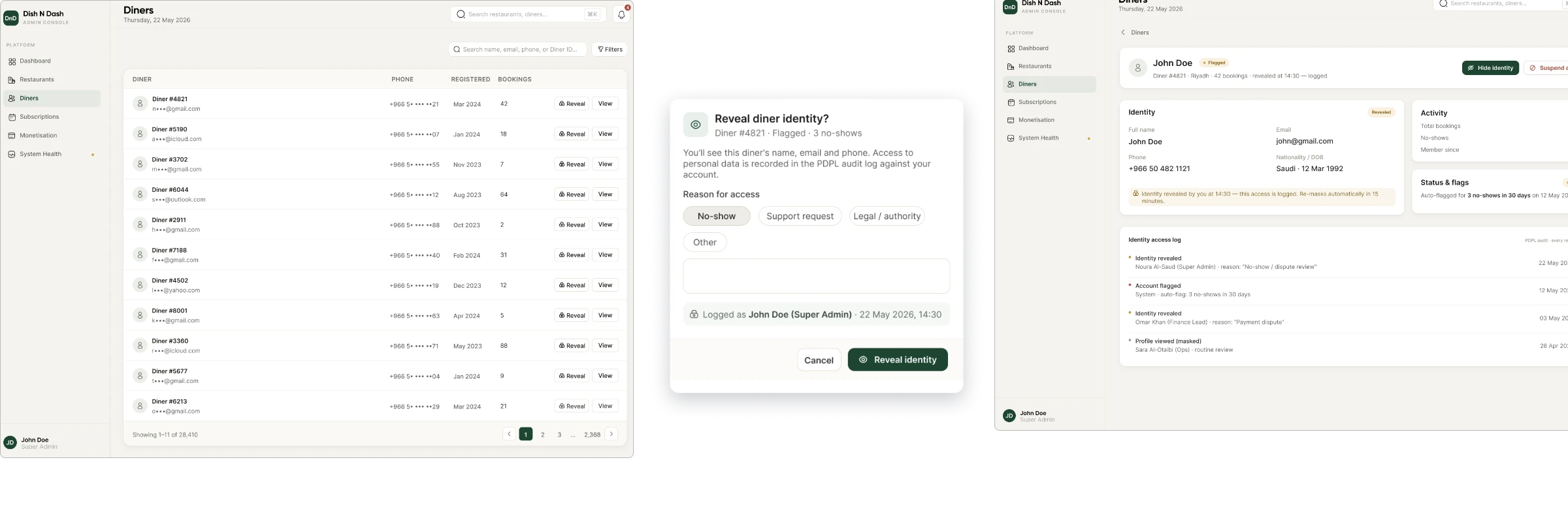
Nobody can leak a name they were never shown. The safe state is the default, and seeing more is the deliberate act.
Check the business, then check what they built
The obvious model is one approval gate at signup. I proposed splitting it in two. Stage 1 verifies the business: commercial registration, VAT number, POS connection. Stage 2 reviews what the restaurant built during onboarding, their menu, floor plan and opening hours, read-only, before anything goes live to diners.
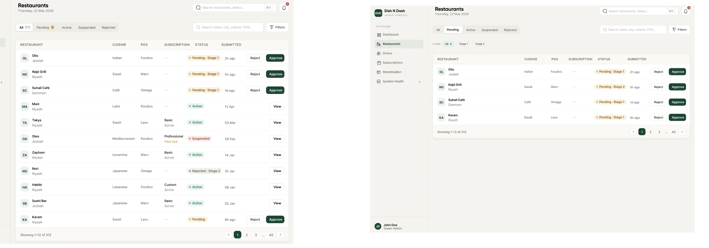
A verified company can still list a bad restaurant. The diner app is only as good as its worst listing, so the second gate is the one that protects it.
What I learned
What I'd do differently
Ask what failure looks like, not just what success looks like
The brief named a failure mode for each surface. That did more scoping work than any feature list could have. I now ask for it at kickoff, because it's easier for a client to describe than a spec is.
Design the operational surface before you trust the consumer one
I built the diner app first and assumed its patterns would carry across. They didn't. A dashboard has states a consumer app never needs, and I found that out three screens in.
When a feature and a constraint fight, look for the third option
Cutting seat selection and pre-ordering would have cost the positioning; keeping them mandatory would have cost the speed. Making them optional cost neither.
To addYour own closing line. The Paper draft had one marked "replace with your own".
Kumo Board: rebuilding our project tool
You made it to the end. Thanks for reading :)